Favorite Before-and-After Photos Show Stunning Transformations
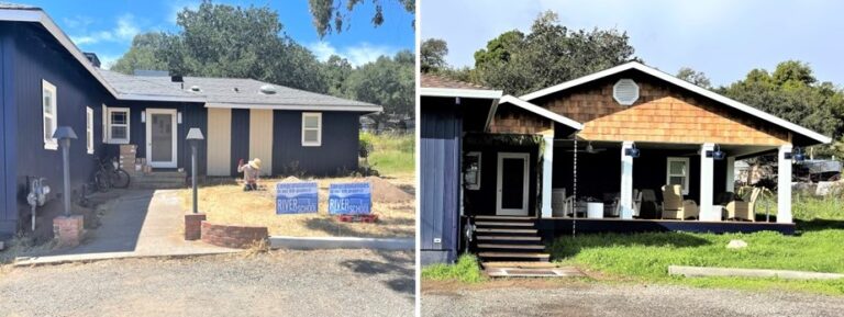
Nothing beats amazing before-and-after shots! Seeing a space in dire need of improvement, then voila! You see the transformation without having to witness all the messy steps, and missteps, in between. If you missed last Wednesday’s post, Leah shared the dramatic change to her Napa, California, home after she added a front porch and handcrafted lighting. Check out the difference…
Today, we’re featuring more of our favorite before-and-after shots shared by customers. Like this incredible kitchen renovation which won a Considered Design Award from Remodelista. Zachary chose The Original™ Warehouse Pendant Light to take center stage in the space which features a blend of both contemporary and traditional touches.
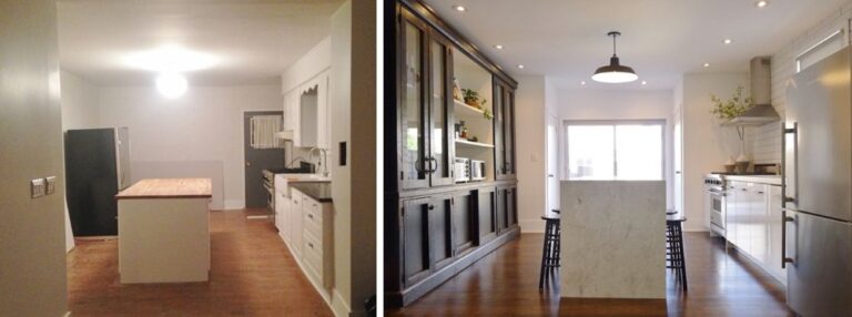
“The Original™, to me, was the most classic choice because it is based on an original vintage design,” he explains. “That gives it longevity and ensures that it will never really go out of style.”
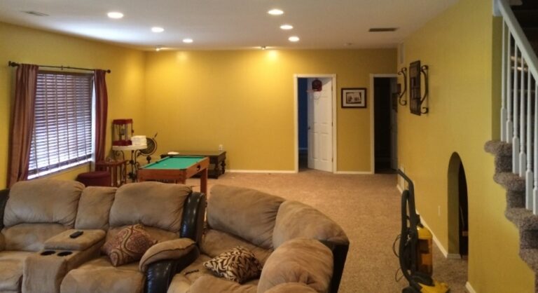
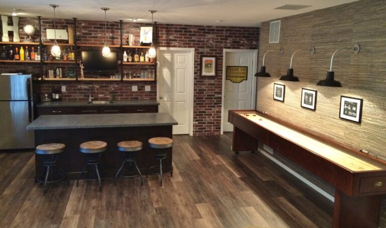
In Wichita, Kansas, Michelle wanted to create an inviting space where friends and family could gather for fun and games. Her basement went from 70s bland (above) to a chic, urban look (below) complete with three Original™ Gooseneck Lights to highlight the new shuffleboard table.
“We wanted to create a place where our friends and our children’s friends could hang out in the safety and supervision of our home,” Michelle says. “We wanted a shuffleboard table and the barn lighting was perfect!”
David’s 1912-era home needed a ton of work, but one of his first projects was the downstairs bathroom that had not been remodeled since the 1960s. Here’s what David started with…
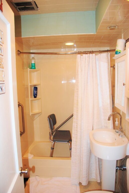
“We removed the walls down to the studs, raised the 7-foot ceiling to the original 9 feet, removed the fiberglass shower/tub enclosure, replaced the toilet and sink, and removed the old tile floor,” he explains.
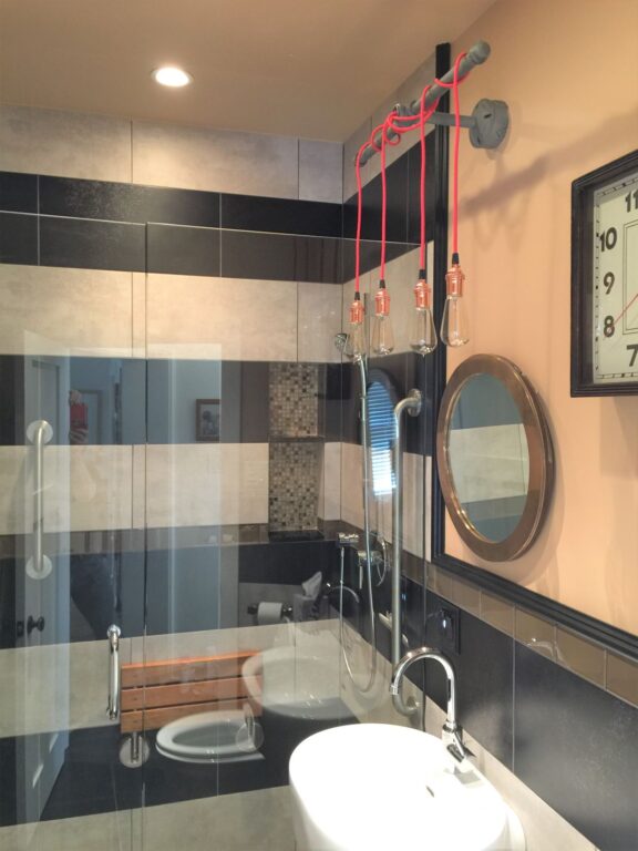
And the incredible reveal….
“The Lang Machine Age Wall Light fit perfectly with our color palette,” David notes, “and also complements the plumbing fixtures for an industrial look.”
We always love watching one of our favorite New York designers in action, and Keri Venti never disappoints. The co-owner of Wolf and Wing Interior Design renovated the front façade of her own bungalow with outstanding results. Her before photo…
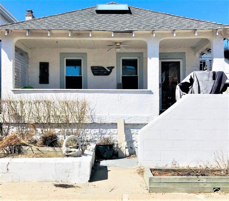
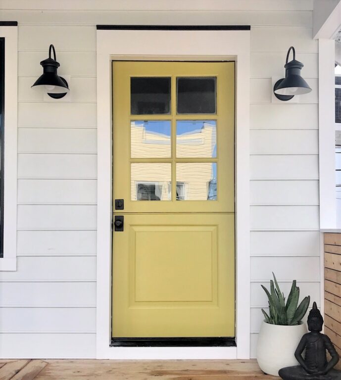
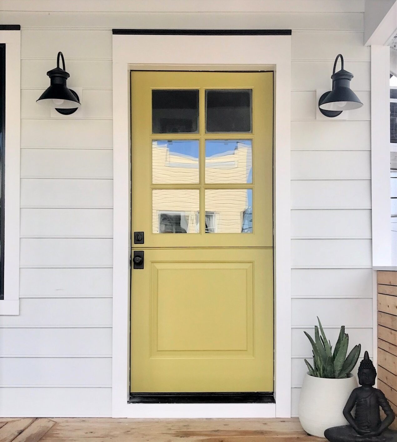
…and the amazing results featuring beaded, Hardie board siding, black accents, a board-and-batten porch skirt, and Cooper Wall Sconces flanking a gorgeous avocado green door.
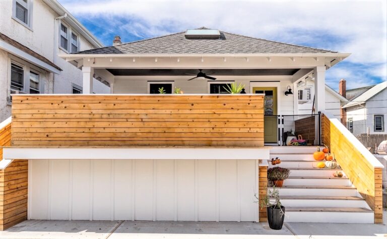
“The entrance of a house is so important. It’s the first thing people see when they arrive, and more importantly, it’s the first thing you see when you come home each day,” Keri notes.
“I was looking for a good quality fixture with a timeless look,” Keri adds. “I love all the options Barn Light offers. They are a go-to vendor when sourcing for my clients for that reason.”
And finally, a tiny powder room gets a makeover thanks to Natalie, from My Vintage Porch, who had big, beautiful ideas for the small space.
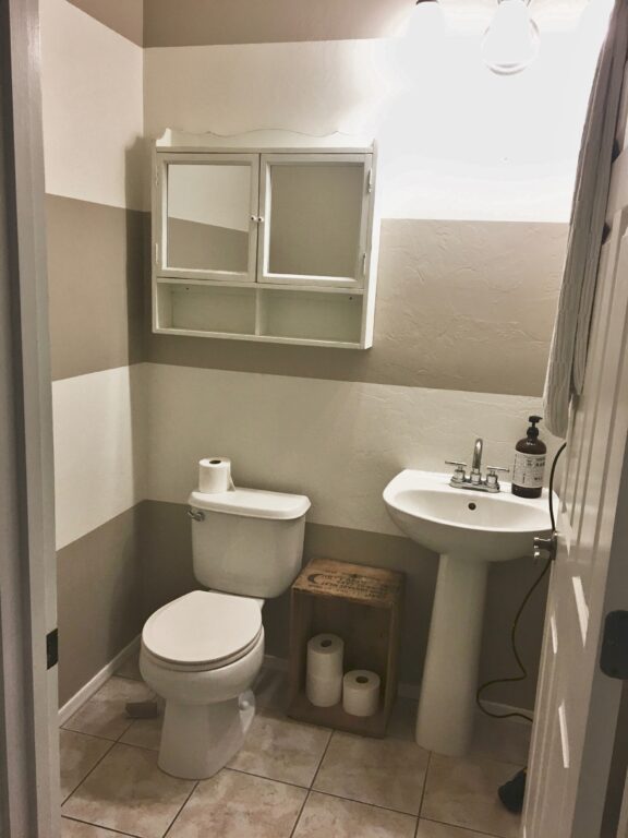
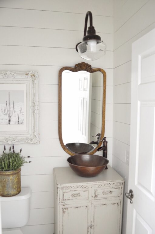
Natalie covered over the striped walls with shiplap and replaced the pedestal sink with, believe it or not, an old record cabinet!
“The biggest thing I wanted to do was add character and to change out that sink with an old dresser-type vanity,” she notes. “The Primary Schoolhouse Gooseneck Light really struck me. I think this fixture gave us just the added touch we were looking for.”
