Preserving History, Adding Modern Style
Renovating is not for the faint of heart. Renovating an older home with modern updates is an even trickier process, but one that Bob Shelton has mastered in his 18 years in the business of home building. As owner of Shelton Design/Build in Pittsburgh, Pennsylvania, Bob embraces the preservation of older homes while adding details and amenities that make sense for modern living.
We caught up with Bob recently to learn more about one of his recent projects that featured the addition of a new kitchen in an older home. Read on to see how Bob captured the best of the home’s history while adding contemporary style.
Q: Where is the home located?
A: In the Point Breeze neighborhood just east of downtown Pittsburgh.
Q: Was this a new build or a remodel? If a remodel, how extensive was it?
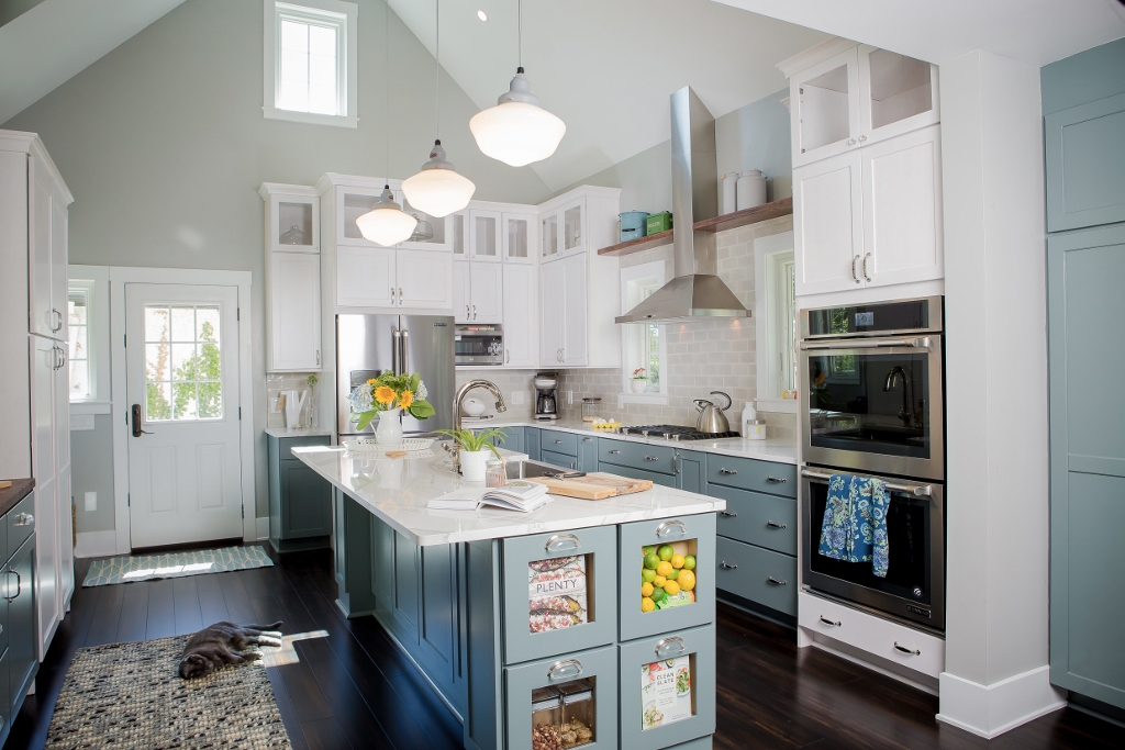
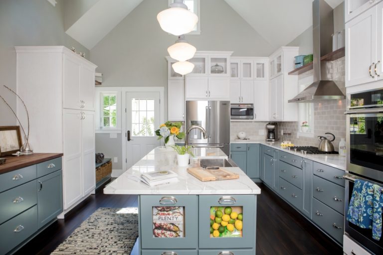
A: This is a new kitchen within a ground-up, one-story, vaulted addition plus a full renovation of the space that was the existing kitchen.
Q: What was your design direction as you worked in this space? What feel were you going for with the colors, materials, and fixtures?
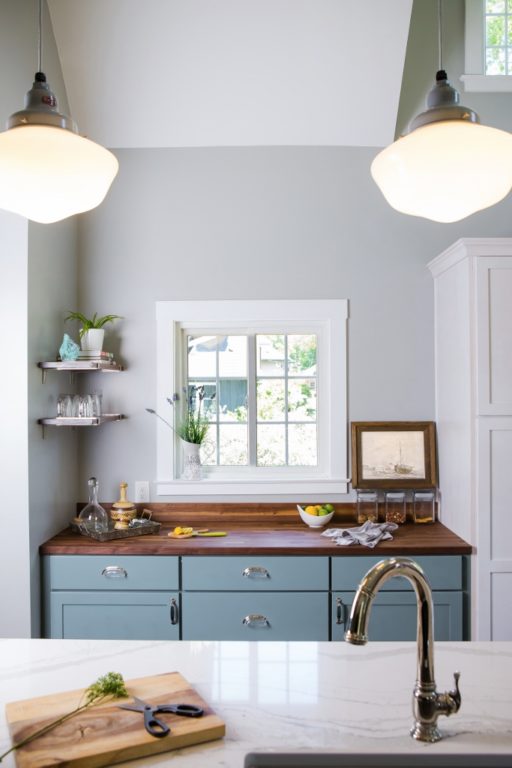
A: The exterior of this home is a very classic, nicely detailed facade within a neighborhood full of character and subtle, refined detail. We wanted the kitchen to also reflect that refined, timeless appearance that the exterior does.
Q: What was important as you looked for lighting this space? American-made fixtures? Color selections? Customizing options?
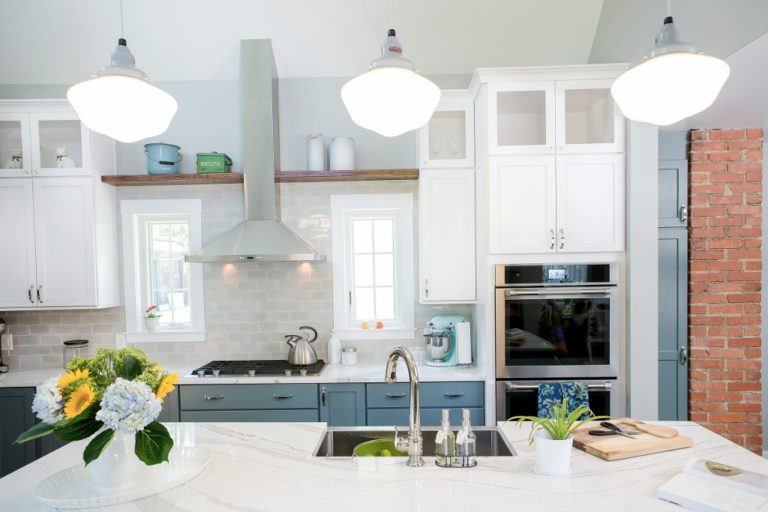
A: We source American-made products whenever we can, and we wanted something that scaled well for this large of a volume. We love fixtures that we have the ability to customize shade, metals, and mounting accessories.
Q: Why did you choose schoolhouse-style lighting for this kitchen?
A: The schoolhouse style fit with our general philosophy as a business: smart modern living within an older home. This style fits the timelessness that we are after, paying respect to the home and neighborhood, but is suitable for this voluminous modern kitchen.
Q: What attracted you to the Primary Schoolhouse Pendant Light in particular?
A: This shade allows light to be functional as task lighting at the island. It attracts attention as a design element rather than seeing through a clear globe or having spot lighting become too harsh at eye level.
Q: Why did you customize the lights with large globes, Industrial Grey fitters, and Gray cotton cords?
A: The cord allows you to pay attention to the volume above rather than seeing thick rods over that much height to the ridge. The large scale shade was appropriate given the overall volume as well as the scale of the island. It was the only non-recessed fixture in the space, so we selected carefully to create a memorable element at the island location.
Q: Now that the lights are up, what do you and your client like best about them?
A: These pendants feel like the most authentic element within the space, as if we transported them here from decades ago. It helps create a multi-layer scale to the height of the space which is what we intended.
Photos courtesy of Laura Petrilla
