Professional’s Corner | Soothing Jadite Adds Touch of the Sea to Coastal Cottage
Have you heard the news? The hottest color palette of the year is a soothing mix of sea blue, emerald green, and creamy jade according to Pantone, the standardized color reproduction system that designers live by. The palette is perfect for coastal-themed homes whether they are located within the reaches of salt air or not. And when Cheryl Sottile, a designer from the Melbourne, Florida, area spotted our Jadite pendants on Houzz recently, she knew the popular porcelain enamel color would suit a renovation project in the Florida Keys to a tee.
“Key Colony is an interesting little island off Marathon Key with a very distinct 60s retro vibe,” Cheryl says. “It’s a close-knit community that really embraces its history in the Keys.” Cheryl’s client had purchased a small cottage as an investment and wanted to update the space while still paying homage to the island’s past.
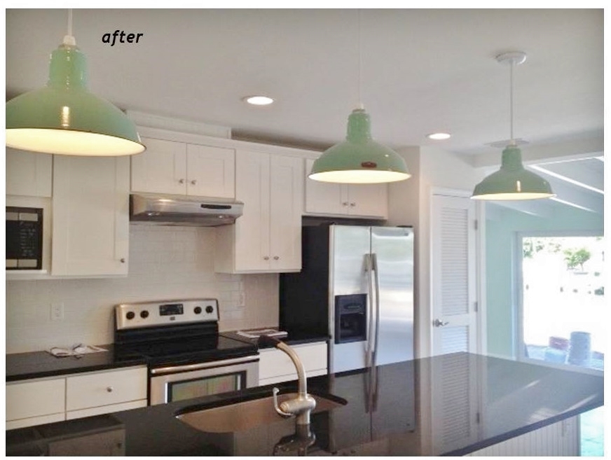
“I wanted to keep it very simple with just splashes of color that were appropriate to the space,” Cheryl explains. “I thought it was very important and felt very natural to bring the outdoors inside as so much of your time in the Keys is spent outdoors looking at the gorgeous tropical colors of the water.” Cheryl chose three of our Ivanhoe® Dino Porcelain Pendant Lights with a Jadite finish for over the new kitchen island.
“I felt that the barn light fixtures were very appropriate blending the past with the present,” she adds. “The color of this fixture reflects the water beautifully and we used this color throughout the home with paint and tile too.” Cheryl compares picking out light fixtures to the way ladies pick out shoes, purses, and jewelry.
“You want just the right balance without going overboard,” she explains. “I like how these lights complement the space without being a distraction. So often I see lighting selections that overwhelm a space. These were perfect for what we were going after with the design. ”
Photos courtesy Cheryl Sottile of Hip Decor


This transformation is amazing! The space looks crisp, clean and drastically bigger. The little pop of color on the lighting is great.It complliments the adjoining room’s paint color perfectly. Great job!
Thanks for your comment Mia! Yes, Cheryl did an amazing job with this space and her client is very happy!
can you tell me the size shade and length of cord you used here?
Hi Jo! These are 12″ shades but I’m not certain to what length Cheryl cut the cord to fit this space. I will try to contact her to find an answer for you!
This looks really nice, I like the updated spin with the vintage. Thanks for sharing all the great pics! Very inspirational to those who adore but uncertain how to mix!
Thanks Denise! Glad the pictures gave you some inspiration!