Schoolhouse Lights Provide Period-Appropriate Charm in Kitchen Remodel
When Chris and his wife decided to undertake a full-gut remodel of the kitchen in their Bellevue, Pennsylvania, home, they wanted to keep the details and charm of the original Craftsman style but update the look and feel of the appliances.
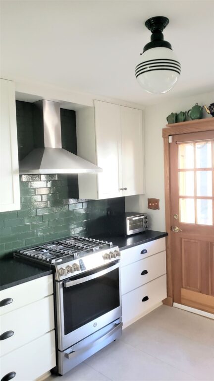
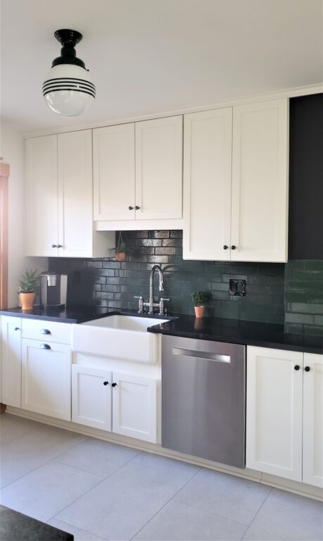
Built in the 1920s in an older, streetcar suburb of Pittsburgh, the home maintains many of the original Craftsman features. When the kitchen was gutted and ready, the couple chose white as the main color for its classic look and a way to brighten the space which doesn’t have much natural light.
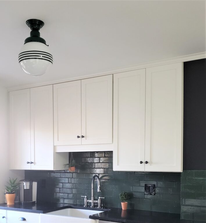
“Many of the images we found of 1920s kitchens featured bold colors and black-and-white checkerboard patterns,” Chris says. “Our new black counters and white Shaker-style cabinets recall the checkerboard motif, and the green backsplash adds the bold color.”
When considering lighting for the kitchen and adjacent hallway, the couple searched for American-made lighting that would be appropriate to the period. An internet search led them to Barn Light Electric’s Schoolhouse Collection.
“Getting something American made was definitely important to us, especially in these times,” Chris explains. “As the kitchen was getting a very distinctive look, we really wanted something that looked like it was made just for that space.”
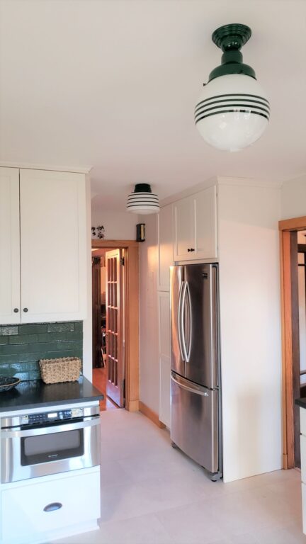
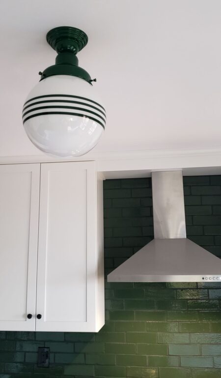
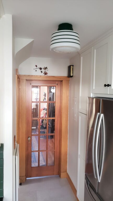
Chris and his wife chose two of Barn Light’s newest Schoolhouse styles — the Drum Schoolhouse and the Round Schoolhouse. Both fixtures are customized with opaque glass, an Emerald Green fitter, and four painted bands of Emerald Green. Although they ordered the Drum Schoolhouse with a Semi-Flush Mount and the Round Schoolhouse with a Flush Mount, they ended up switching the globes.
“We intended on using the drum fixture in the center of the kitchen, but once they were installed, it seemed to fit better with the round globe in the center. It was super easy to swap globes between the two fixtures,” Chris notes. “The schoolhouse style is period appropriate to our kitchen without feeling too fussy for the overall design.”
Using the same painted bands on both fixtures and the same finish color helps tie the two fixtures and spaces together. The hall space with the fridge is tighter so the flush mount works well here while the semi-flush mount fixture in the center of the kitchen is more of a statement piece.
“The round globe really fills the space and feels like a prominent feature in the room in a way I didn’t expect. The ability to customize the fixtures to tie in with the green in the backsplash was huge in bringing the whole kitchen together,” Chris says. “The fixtures really look like they were made specifically with our kitchen in mind and it makes the whole space feel complete.”
Photos courtesy of the homeowner
