Angle Shades a Risky Yet Rewarding Choice for Decatur Kitchen Renovation
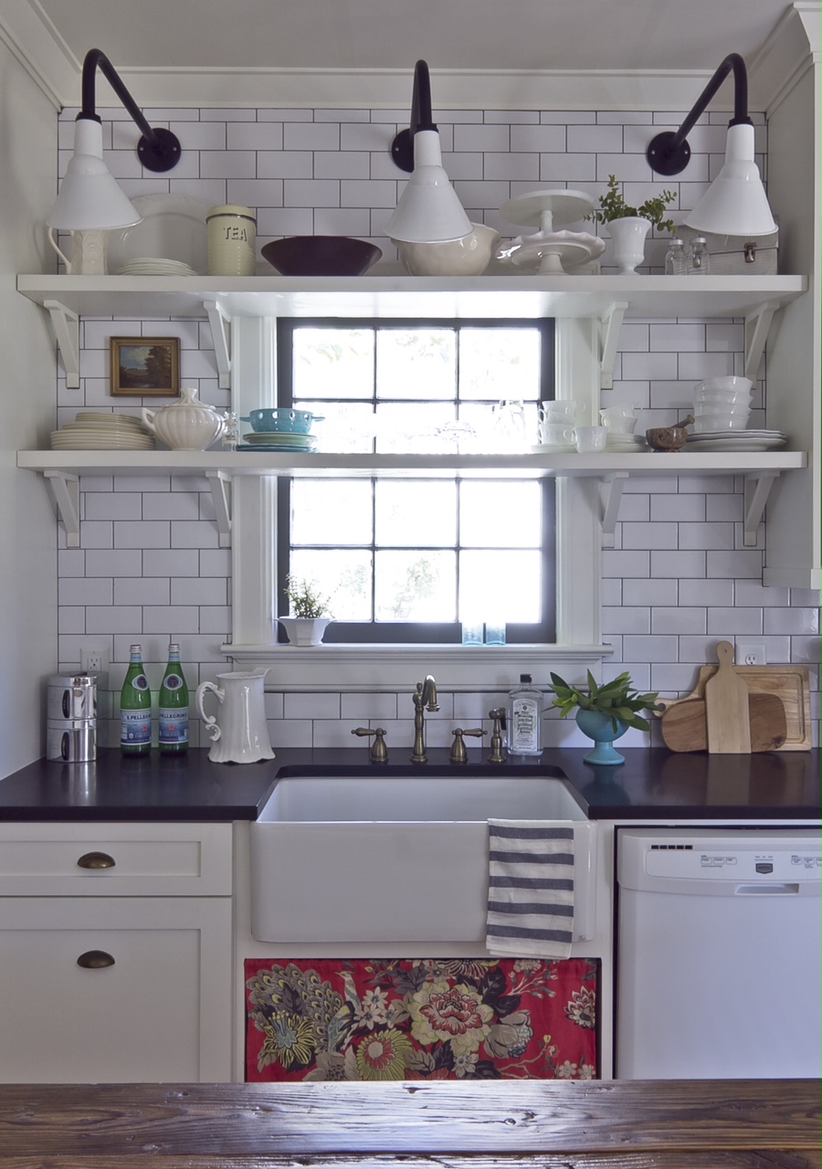
Designers love to push the envelope sometimes and take risks with interior decorating. For this kitchen renovation in Decatur, Georgia, the client couldn’t be happier with the creative work of Julie Holloway and Anisa Darnell of Milk and Honey Home. In a bold move, the duo chose some classic angle shades for over the kitchen sink. “We know they are typically used for outdoor sign lighting, but we just love the old vintage feel they give,” explains Anisa. “We needed a sconce that would have a long enough arm to stick out past the shelf over the window and reflect back onto the collection of dishes. And the angle shade did just that! It was a risk worth taking!”
Lending the perfect angle of light are three 8″ Fire Chief Sign Lights in a White finish with a G8 gooseneck arm in a contrasting Black finish.
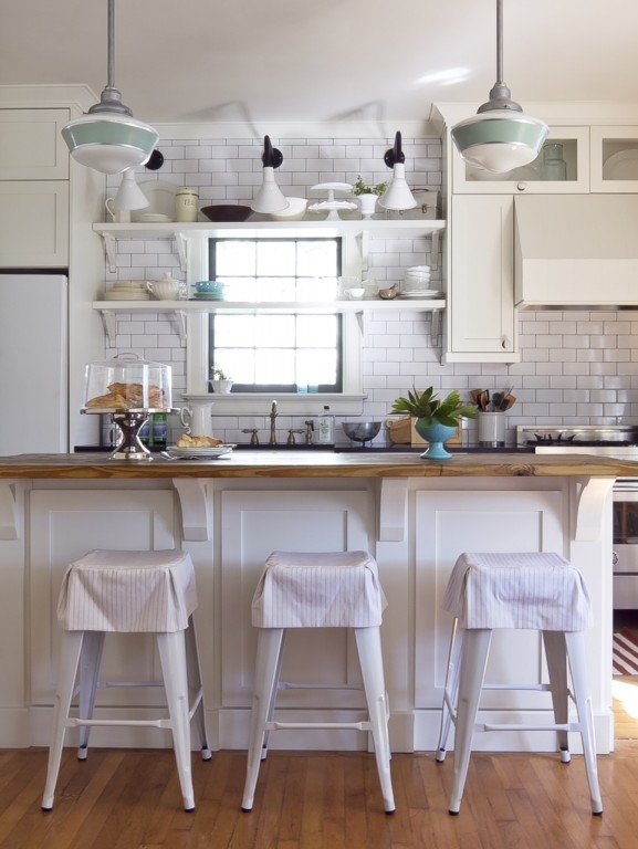
The design duo wanted to keep the renovations true to the late 1930s-era home but with modern updates. They describe their clients as “fun and adventurous” so they made design choices to reflect that personality. Over the reclaimed wood island, Julia and Anisa chose two Primary Schoolhouse Stem Mount Lights with a large sized globe and a single painted band of Jadite.
“We wanted to make the traditional schoolhouse pendant a little more playful and unique with the touch of Jadite,” Julia says. “We love the classic lines of the schoolhouse lights. They are the showpiece of the kitchen and gave the client practical lighting over the island.” The lights are further customized with an 18″ galvanized stem and canopy.
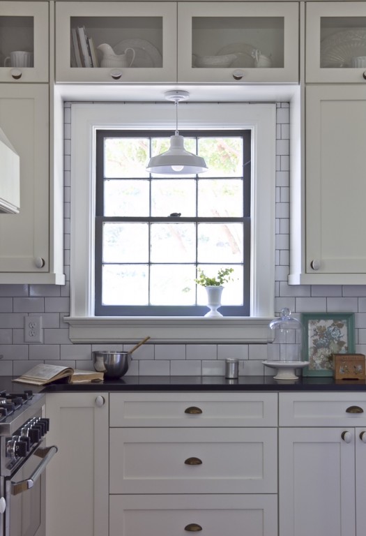
More practical lighting was needed in the baking area of the kitchen so the team chose the American made Farm & Barn Cord Hung Pendant in White with a 15″ shade for plenty of downlighting onto the counter.
“We love depot lights and feel like they are timeless,” Anisa notes. “They complement the lighting in the rest of the kitchen without stealing the show because they are so simple.” Because they didn’t want the kitchen to look like an obvious remodel, Anisa and Julie carefully mixed styles and finishes.
“We love mixing finishes and we always make sure that they are balanced with the rest of the decor,” Anisa says. “We wanted this kitchen to look like it was collected over time, to flow with the rest of the home for more of an eclectic feel. We think the lights are beautiful and unique. We took a risk so probably none of their neighbors have them!”
Photos courtesy of Jennifer Kesler Photography


