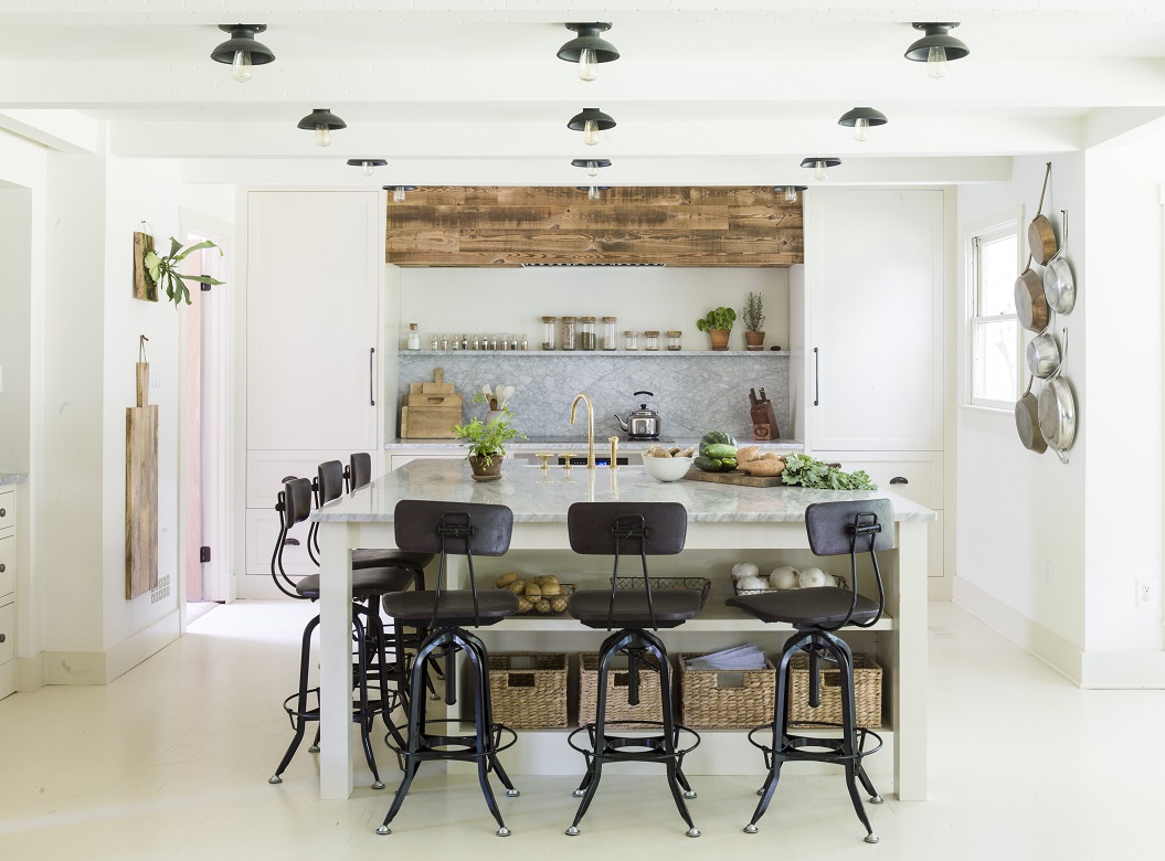
Kitchen Lighting That Kicks Recessed Cans to the Curb
In her search for new kitchen lighting for her northern Virginia home, designer Lauren Liess wanted an alternative to traditional can lighting.
“Because our house is a Cape Cod, I looked to old colonial kitchens for inspiration,” Lauren says. “I wanted the kitchen to feel light and airy, very accessible, and easy to work in.”
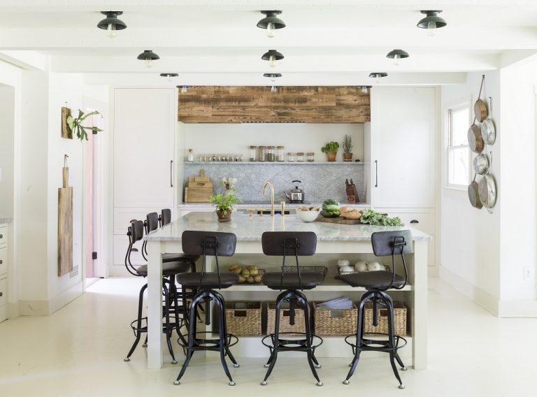
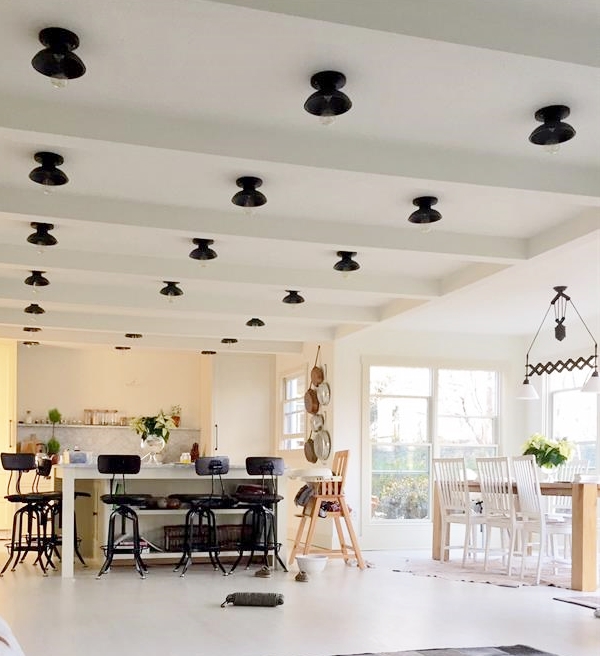
Lauren and her husband David own an interior design firm and textiles company and have been renovating their home for almost a year. Lauren created a clean and modern layout with open cabinetry balanced with rustic touches. She found the perfect alternative to can lighting in the Kao Flush Mount Pendant.
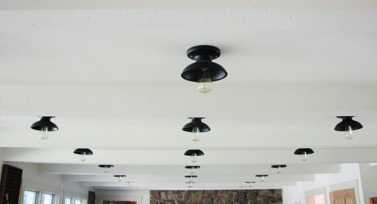
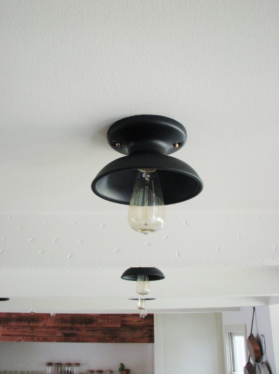
“Its size and scale was just what I needed for my kitchen lighting,” she notes. Lauren customized these compact ceiling lights with a Textured Black finish and Edison style light bulbs. Thirty of the fixtures line the ceiling between her kitchen and adjoining living space.
“I love the shot of black and contrast they provide in my almost all-white kitchen,” Lauren explains. “The functionality was important as we looked for lighting, but I was looking for a design that could feel both traditional and modern.”
The design of this flush mount pendant dates back to fixtures originally manufactured by Pass & Seymour. While these lights added unique style to kitchens throughout the 1950s, they look right at home in this modern setting. Made from solid porcelain ceramic, this kitchen pendant is available in 27 finish colors to take a space from traditional to trendy.
“It feels like a party every night! The Edison bulbs give our kitchen this amazing, cozy, warm glow every evening,” Lauren says. “We put them on dimmers. When you turn on the lights, it instantly feels special and fun. I had no idea how much I’d love going with the Kao fixtures over recessed!”
Photos courtesy Lauren Liess


I love what Lauren did here. I read it on her blog a few weeks ago and thought it was such a great idea! No more can lights!
We agree Miranda! Way cuter than cans!
It’s interesting. I don’t actually care for it, but I do believe it will help me find something that works with our kitchen.
NOTE: WE LIKE THESE AND ALL THE LIGHTS BY BARN LIGHT— SO THE FOLLOWING IS NOT ABOUT THE LIGHTS OR THE DESIGN–BUT ABOUT THE RELATIONSHIP OF CEILING HEIGHT TO THE DESIGN AND NUMBER OF CEILING FIXTURES.
THESE MULTIPLE MINI FIXTURES–OF WHATEVER COLOR– WORK WELL IF A CEILING IS HIGH ENOUGH–BUT WHERE A KITCHEN (OR ANY) CEILING IS RELATIVELY LOW– THEN THE EXTRA “SHADE” –WHATEVER THE COLOR–ACTS TO MAKE THE CEILING LOOK EVEN LOWER AND THE FLOOR TO CEILING SPACE LOOK CROWDED.
SO…IN OUR OPEN “FARMHOUSE KITCHEN” –IN A HOUSE ON A NEW ENGLAND SEA ISLAND WITH TRADITIONALLY LOW CEILINGS ON THE MAIN FLOOR ( HEATED WITH WOOD STOVE IN THE WINTER!) WE INITIALLY USED 60-90 WATT DIM-ABLE INDOOR FLOOD LIGHTS SCREWED DIRECTLY INTO A SIMPLE PORCELAIN RECEPTACLES INSIDE THE CEILING — IN A LINE OVER THE KITCHEN COUNTERS AND ISLAND. THE OPENING TO THE CEILING WAS COVERED WITH A THIN METAL COVER PLATE THE SAME COLOR AS THE CEILING… THRU WHICH A SERIES OF 60 W FLOOD LITE BULBS WERE SCREWED INTO EACH RECEPTICLE. THEY WERE WIRED IN SEQUENCE–AND ARE ON A DIMMER.
WITH THE ADVENT OF NEW STYLE SEMI-SCULPTED OPEN GREEN DIMMER BULBS, ONE CAN ACHIEVE AN EVEN LESS BULKY LOOK— WE SWITCHED TO SEMI SCULPTED MUCH LESS BULKY INSIDE DIMMABLE “GREEN” FLOODLITE BULBS–WHICH PROVIDE AN EVEN “LIGHTER” MORE OPEN LOOK AGAINST THE CEILING…..
THAT SAID: WITH A HIGH CEILING, THE BARN LIGHT FIXTURES SHOWN WOULD BE PERFECT!